Add a New Page
Adding a new page in ShipNowKit follows the same pattern as in Next.js. Simply create a new folder in the
app/directory and add apage.tsxfile inside it. Let's walk through this process with a practical example.
Creating a Basic Page
To create a new page, follow these steps:
-
Create a new folder in the
app/directory (e.g.,about) -
Add a
page.tsxfile inside this folder -
Create a React component for your page
Here's a simple example:
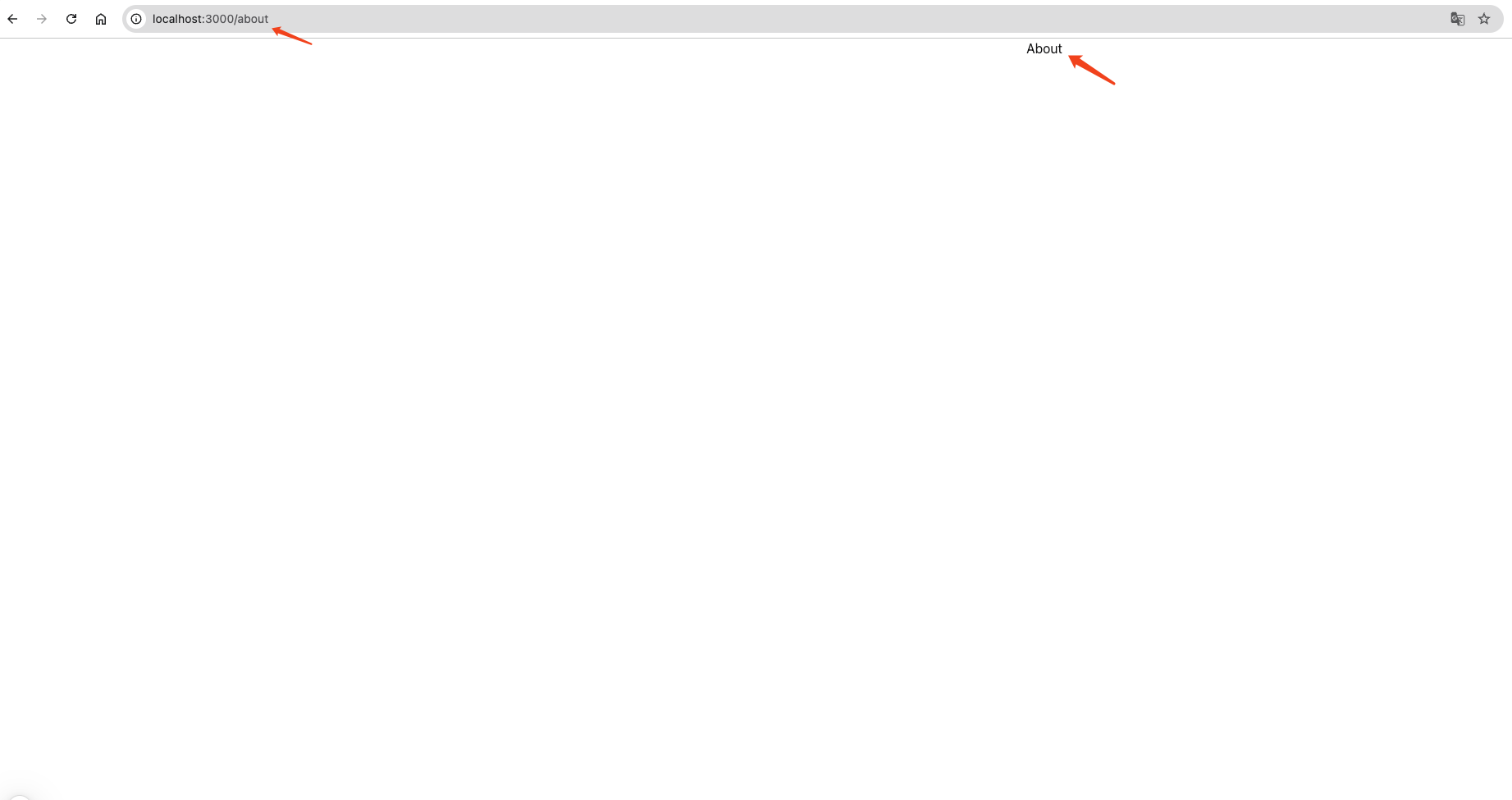
export default function AboutPage() {

return <div>About</div>;

}
This creates a new page that's accessible at /about in your website.
Styling with Tailwind CSS
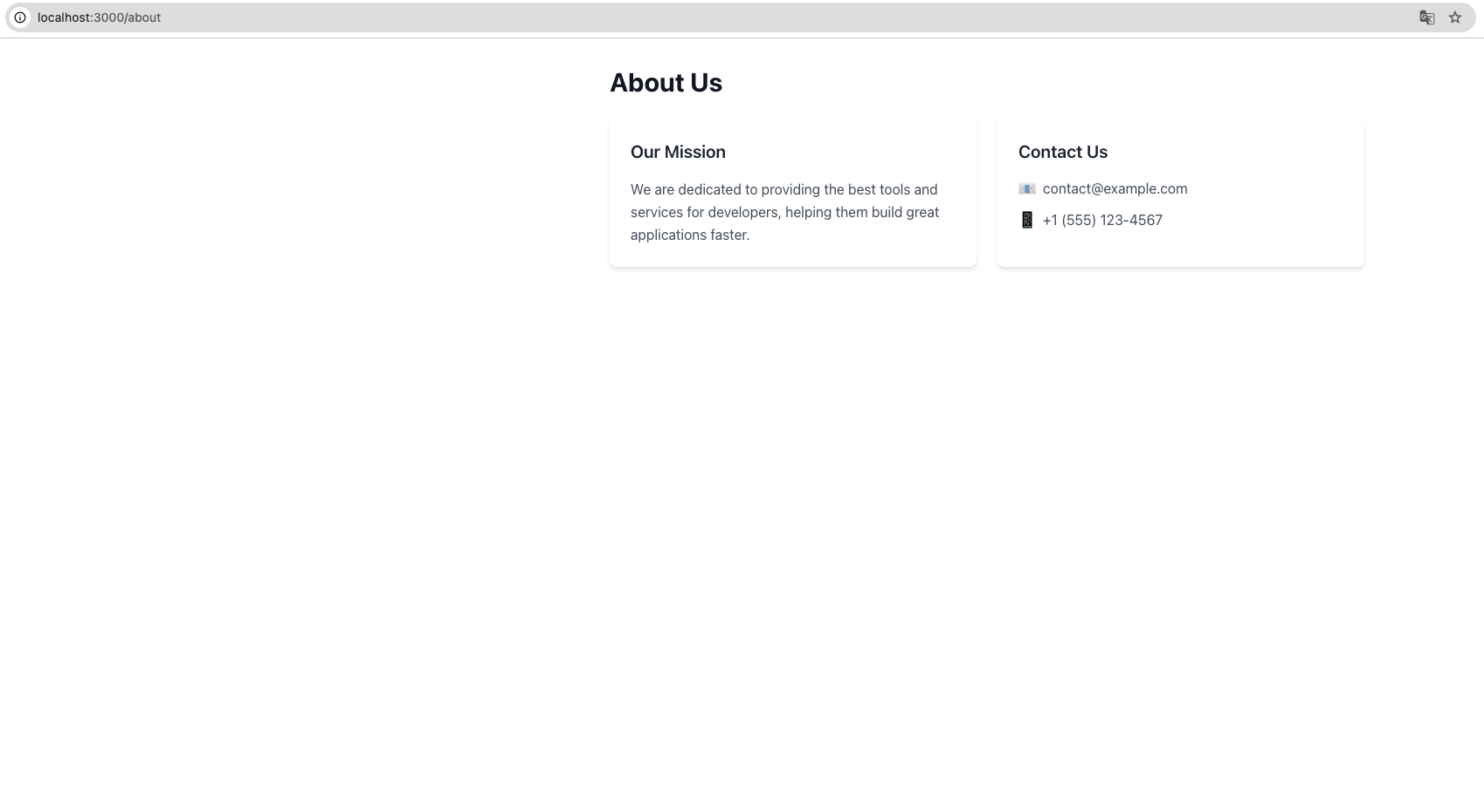
ShipNowKit comes with Tailwind CSS pre-integrated, allowing you to immediately start using its utility classes for styling. Let's enhance our page with a professional layout:
export default function AboutPage() {
  return (
    <div className="max-w-4xl mx-auto px-4 py-8">
      <h1 className="text-3xl font-bold text-gray-900 mb-6">
        About Us
      </h1>

      <div className="grid md:grid-cols-2 gap-6">
        <div className="bg-white p-6 rounded-lg shadow-md">
          <h2 className="text-xl font-semibold text-gray-800 mb-4">
            Our Mission
          </h2>
          <p className="text-gray-600 leading-relaxed">
            We are dedicated to providing the best tools and services for developers,
            helping them build great applications faster.
          </p>
        </div>

        <div className="bg-white p-6 rounded-lg shadow-md">
          <h2 className="text-xl font-semibold text-gray-800 mb-4">
            Contact Us
          </h2>
          <div className="space-y-3">
            <p className="flex items-center text-gray-600">
              <span className="mr-2">📧</span> contact@example.com
            </p>
            <p className="flex items-center text-gray-600">
              <span className="mr-2">📱</span> +1 (555) 123-4567
            </p>
          </div>
        </div>
      </div>
    </div>
  );
}
Understanding the Tailwind Classes
Let's break down the key Tailwind CSS classes used in this example:
-
Layout Classes:
-
max-w-4xl mx-auto: Limits content width and centers it horizontally -
grid md:grid-cols-2: Creates a responsive two-column grid layout -
flex items-center: Aligns items vertically in a flex container -
Spacing Classes:
-
px-4 py-8: Adds horizontal and vertical padding -
mb-6: Adds margin to the bottom -
gap-6: Sets spacing between grid items -
Visual Styling:
-
bg-white: Sets background color -
rounded-lg: Adds rounded corners -
shadow-md: Applies a medium-sized shadow -
Typography Classes:
-
text-3xl: Sets font size -
font-bold: Controls font weight -
text-gray-900: Sets text color
Responsive Design
Tailwind CSS uses a mobile-first approach to responsive design. Use breakpoint prefixes to apply styles at specific screen sizes:
-
sm:- Small screens (640px and up) -
md:- Medium screens (768px and up) -
lg:- Large screens (1024px and up) -
xl:- Extra large screens (1280px and up)
For example, md:grid-cols-2 applies the two-column layout only on medium-sized screens and larger.
Further Resources
-
Tailwind CSS Documentation - Complete reference for all available utility classes
-
Next.js Pages Documentation - Learn more about page routing in Next.js